Portfolio
Discover the creative world of Abby Grace Design—a portfolio showcasing bold ideas, thoughtful design, and a passion for visual storytelling. Whether you're looking for branding, digital graphics, or print design, my work reflects a commitment to clarity, style, and impact. Take a look and see how design can elevate your message.
Abby Grace Design branding work is rooted in storytelling, guided by strategy, and brought to life with elegance.
Every illustration is thoughtfully crafted to tell a story—adding charm, depth, and a personal touch to each brand. Explore the portfolio to see how custom artwork brings beauty and meaning to every detail.
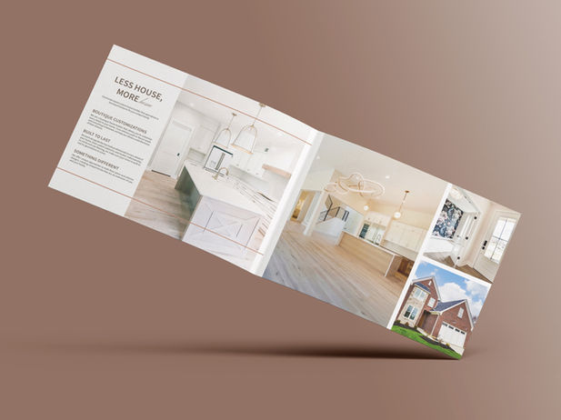
Abby Grace Design creates publications with clarity and purpose, balancing creativity and precision to tell stories that are both engaging and easy to navigate.
Branding
Foundry Student Ministry
The branding for Foundry Students Ministry brings energy and character to life through "Rusty," a retro-inspired anvil icon that feels both strong and approachable. Staying true to Foundry’s identity, the design keeps the signature rust orange and metal grey palette, tying the ministry to the larger church family. Rusty represents resilience, growth, and a sense of belonging — a playful yet meaningful symbol for students forging their faith and friendships together.
The Color Palette
#E4D8B8
#231f20
#F98B4E
Meet Rusty the Anvil
Foundry Students’ strong, steady, and always-smiling mascot. Rusty’s the kind of guy who’s built tough but has a big heart. He represents growth through challenge, the power of community, and a reminder that faith is forged, not faked. Whether you’re new or a regular, Rusty’s here to say, “Iron sharpens iron—and we’re stronger together.”


The Merch
Foundry Students Ministry merch brings energy and identity to life through “Rusty,” the retro-inspired anvil icon. Featuring the signature rust orange and metal grey palette, each piece reflects strength, growth, and community — a symbol of students forging faith and friendships together.
Foundry Childrens Ministry
For the Foundry Children's Ministry rebrand, I focused on creating a cohesive yet distinctive identity for each branch of the ministry. My goal was to design icons that kids could connect with while establishing a clear visual distinction between younger and older age groups. By maintaining consistent branding colors across all icons, I ensured unity, while incorporating the church’s established type and thematic elements for a seamless integration with their overall identity. These icons will be featured on merchandise such as t-shirts, onesies, and journals, as well as wall decals and various publications, enhancing both engagement and brand recognition.
The Color Palette
#EBE1D4
#93B4D8
#EF6C4B
#68BA99


The Merch
The Foundry Kids merch was designed with both purpose and playfulness in mind. Dark-colored volunteer t-shirts keep things practical for the fun (and messes) of kids' ministry, while still feeling cheerful and on-brand. A soft, custom onesie welcomes new babies to the church family — a sweet and thoughtful touch that reflects the heart of Foundry’s commitment to every age and stage.
Generosity.Partners
Generosity.Partners is a nonprofit organization dedicated to helping churches and other nonprofits thrive financially. Through expert guidance in stewardship, fundraising, and financial management, they equip leaders with the tools and confidence to navigate their financial journey. With a heart for generosity and a commitment to mission-driven impact, Generosity.Partners comes alongside organizations to help them grow, give, and serve well.
The Color Palette
#2D3B40
#FDF8D8
#FBAE3D
#F15623

The Logo
The buffalo in the Generosity.Partners logo symbolizes strength, resilience, and a bold approach to challenges. Just as buffalo run into the storm rather than away from it, we face obstacles head-on, guiding churches and nonprofits through the challenges of stewardship and fundraising. By embracing difficulties with courage and strategy, we help organizations emerge stronger, more equipped, and ready to make a lasting impact.
Fonts


Usages
Brand Guidelines
This document serves as a foundation for how Generosity.Partners presents itself across all touchpoints. It ensures consistency in our voice, visuals, and values—so that every message we share reflects who we are and what we stand for.


Kansas State Gardens
150th Anniversary
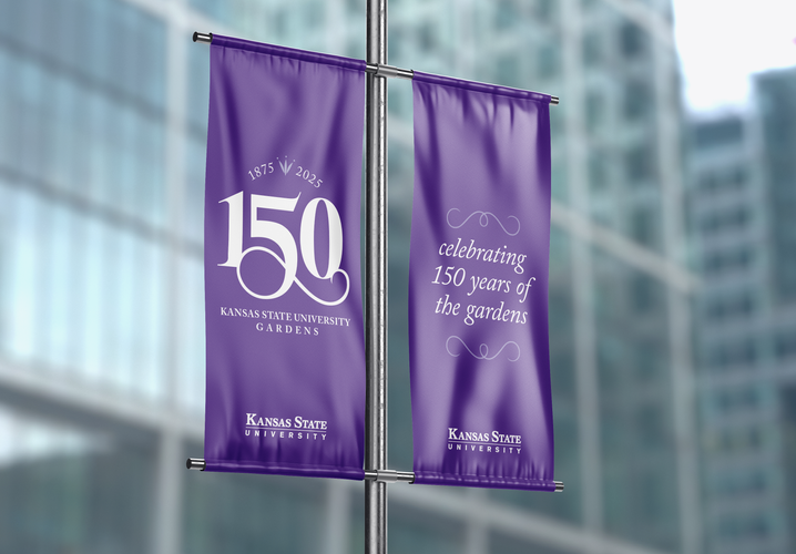
For the 150th anniversary of the Kansas State University Gardens, a commemorative logo was created to honor the gardens’ long-standing history while celebrating the future ahead. The design draws inspiration from the swoosh element in the Friends of the Gardens logo, which is echoed in the anniversary mark. Staying within K-State brand standards, Adobe Caslon served as the foundation for the “150,” with added embellishments and refinements to create a sense of elegance and distinction. The icon at the top incorporates a piece of the Friends of the Gardens logo, tying the design back to its roots while marking this important milestone.
The Color Palette
The color palette is inspired by the original Friends of the Gardens icon, incorporating its familiar tones along with classic K-State brand purple to honor tradition and create a cohesive, refreshed look.

#4F2683
#8F81B9
#A5A0C7
#9ACF8B
#9FD5BB
#5CBDAA

The Icon
The K-State 150th anniversary icon blends tradition with refinement, celebrating a legacy of growth and community. The type is based on Kansas State University’s official brand font, carefully customized to add elegance and a sense of movement. The icon itself is a simplified version of the original Friends of the Gardens mark, creating a timeless, unified look that honors the past while looking forward.


Usages
Designed for versatility, the K-State 150th anniversary icon is easily adaptable across a wide range of platforms — from print materials and signage to digital media and merchandise. Its clean, simplified form ensures clarity at any size, while its elegant details maintain visual impact whether used as a focal point or supporting element. This flexibility allows the icon to consistently reinforce the anniversary branding wherever it appears.
Catalyst Coffee Company
Catalyst Coffee Company is a community-driven coffee brand that believes in the power of connection and the beauty of the outdoors. Rooted in local values, they prioritize building strong neighborhood relationships while inspiring people to slow down, explore nature, and share meaningful moments over a great cup of coffee.
The Icon
The Catalyst Coffee Company icon blends house shapes, splashes of coffee, and subtle facial features to symbolize the heart of a neighborhood community. The house elements represent local connection, while the coffee splash embodies energy, warmth, and the catalyst that brings people together. Together, these details create a friendly, approachable mark that reflects the company’s mission to unite people through coffee and community.
The Color Palette
#2D3B40
#F7F0E4
#FBAE3D
#F15623
Fonts


Packaging
Catalyst Coffee Company’s packaging captures the vibrant spirit of community and the energizing nature of coffee. Bold colors and lively design elements reflect a love for the outdoors and neighborhood connection. Fragments of the Catalyst icon are creatively used as dynamic illustrations throughout the packaging, adding a playful and cohesive visual language that celebrates movement, togetherness, and the spark that coffee brings to everyday life.


Kirjalo Bookstore
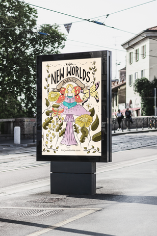
Kirjalo Bookstore is a family-owned treasure where Victorian charm and a hint of magic come together to create a warm, welcoming space. Specializing in secondhand books, Kirjalo believes every story deserves a second life — just like the community it lovingly serves. From local events to cozy book clubs, Kirjalo is more than a bookstore; it’s a gathering place where neighbors become friends and every shelf holds a new adventure waiting to be rediscovered.
Primary Color Palette
#261E13
#F05345
#EED3E2

The Logo
The Kirjalo icon draws inspiration from intricate Victorian-era glyphs, blending elegance and storybook charm into a simple, timeless mark. Shaped like an open book, the design captures the heart of Kirjalo’s love for stories old and new, while a delicate star tucked within the pages hints at the magic and whimsy waiting to be discovered. It’s a symbol of imagination, tradition, and the quiet wonder that defines Kirjalo.
Secondary Color Palette
#42A4A3
#6A5D26
#D8B851
Icon

App Icon
Illustration
Kansas State University Open House
K-State Open House is an annual spring event held on the K-State campus, inviting families to explore and connect with the different colleges and programs. This design was created with alumni, families, and young adults in mind, capturing both the welcoming spirit and long-standing traditions of the university. At the center of the illustration is Anderson Hall, one of the oldest and most iconic buildings on campus, symbolizing K-State’s rich history and strong sense of community.


Usages


Christmas Postcards
Spread holiday cheer with these warm and playful illustrated Christmas postcards from Abby Grace Design. Each card features charming, hand-drawn artwork that captures the magic of the season—perfect for sending a heartfelt note or adding a whimsical touch to your holiday gifts.


Strawberry Terry
This pair of postage stamp–style illustrations shows a sage, world-weary strawberry on the phone with a younger strawberry. Surrounded by framed family photos, the elder listens with thinly veiled exasperation as the younger launches into her latest round of gossip and drama. The scene blends humor and subtle judgment in a playful nod to family communication.


Patterns
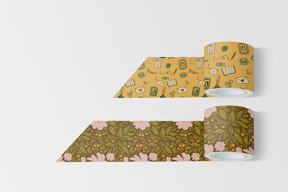
My pattern illustration work celebrates the quirky charm and personal touch of hand-drawn design. I enjoy creating patterns that are both beautiful and practical, adding a playful sense of whimsy to everyday life. Whether featured on products, packaging, or textiles, each design reflects my passion for art that feels personal, creative, and joyfully unique.


